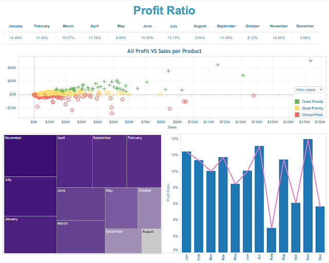
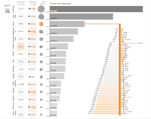
My Ugly Ass Dashboard - Hey It was Pretty Cool though...
Come check my profile out on Tableau public. I founded a lot of cool practices in Tableau.
Lets dive in. This is ugly. Wow. My ugly ass dashboard is not winning anyone's heart.

Not the best thing to look at. I should have followed some color palette best practices. More than 7, you're going to lose your audience. And if they don't blend, it looks like poo.
Remember though, I made this dashboard in a single session at a coffee shop. No product to date can accomplish this task. Tableau rocks.
Lets dive in. This is ugly. Wow. My ugly ass dashboard is not winning anyone's heart.

Not the best thing to look at. I should have followed some color palette best practices. More than 7, you're going to lose your audience. And if they don't blend, it looks like poo.
Remember though, I made this dashboard in a single session at a coffee shop. No product to date can accomplish this task. Tableau rocks.
Ugly ass dashboards in 2017
Don't do it! Avoid the urge to make that ugly fuggly thing.
Make beautiful dashboards, and also don't forget to go search my name at Tableau Public. I've got dashboards that have been views nearly 10k times and they are 100% educational.
I wrote the book on best practices back in the day.
I wrote the book on best practices back in the day.


Comments
Post a Comment
Please leave a comment and link to content related to the blog post. If it adds value, collaborative, or related to networking - we will add it.